Literary author Zena needed a home that could hold the weight of seven novels, eleven languages, and a Booker Prize longlist — without leaning on either. Quiet, elegant, precise.
Make a site that feels like the writing. Zena's work is restrained, atmospheric, deeply observed — and the previous site was none of those things.
The challenge: literary fiction audiences are discerning. The site had to earn their trust without announcing itself. Every typographic decision, every breath of whitespace, had to be earned.
7
Novels showcased across the site
11
Languages the work has been translated into
3×
Increase in shop conversion after launch
What we did
3 disciplines. One voice.
01 — Identity
Brand & Wordmark
A bespoke wordmark anchored in Georgia — the serif of choice for literary publishing. The feather motif: a nod to the quill without being obvious about it. The mark works at any size and in any weight of light.
02 — Web Design
Site Design & Build
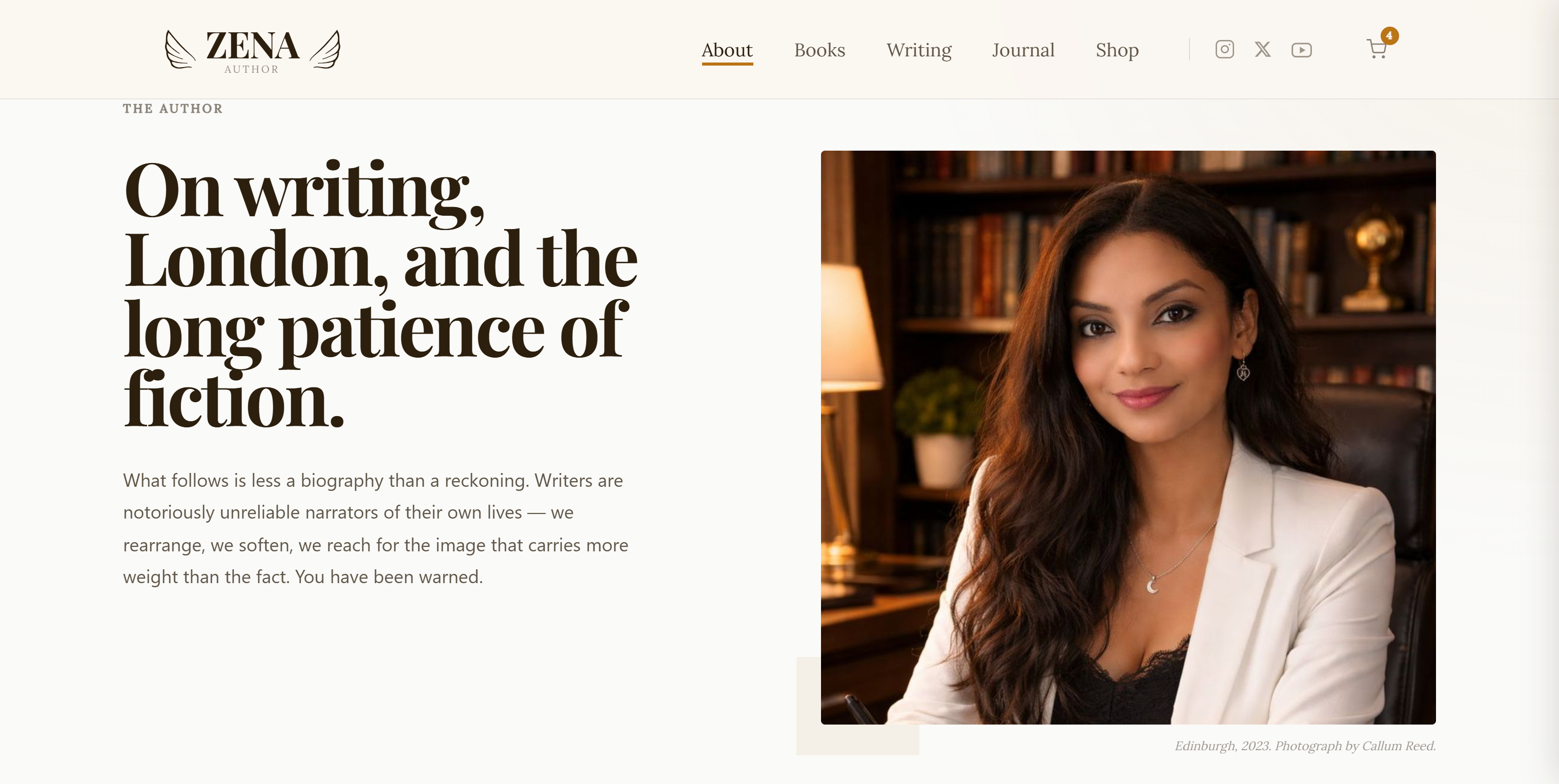
Edinburgh street photography as atmosphere, not decoration. Warm bronze accents that feel like candlelight. A type system that privileges the reader's eye — every heading earns its weight before it's set.
03 — Commerce
Shop & Distribution
A fully integrated e-commerce shop and CMS. Zena publishes a new essay — it appears on the site, goes to the mailing list, posts to Instagram. One action. Everything else is automatic.
"
I stopped apologising for my website the day it went live. Now I send people there on purpose.